
The Preview App is a tool produced by Arity intended for their sales team to demo Arity's products with just a tap of their finger. It acts almost like a "trial version" of Arity's products, giving potential customers a taste of the features they offer without committing to a full purchase. However, learning how to use the app effectively without a native team member was next to impossible– thus, I designed a post-onboarding tutorial flow to aid in this process.
My journey began with breaking down the use case of the Preview App. Why are people using it and how were they doing so? This helped me understand the app more intimately from the perspective of its actual users (in this case, the Arity sales team). I quickly dissected Arity's use case with FigJam's sticky notes.

I then went on a deep dive into how other apps guide their users, selecting five top-tier examples to learn from their success, which taught me that the best tutorials are contextual, interactive, and concise. While I looked at over 100 screens across 50 apps, I found the most information from automotive/transportation and productivity apps.

Then, to pinpoint the Preview App's specific issues, I put on my detective hat and performed a heuristic evaluation with fellow UXers and tested the app myself, discovering vague sections, UI inconsistencies, and so much more. Some notable comments from these heuristic evals were:
This hands-on research validated the need for a tutorial and laid the groundwork for my future designs. I established the tutorial process by creating a step-by-step outline of what procedures the user would undertake as they navigated through this tutorial. I then translated this outline into a workflow to further visualize this process.


"Tutorials interrupt users, don’t necessarily improve task performance, and are quickly forgotten. Contextual help signals can avoid these pitfalls but require unintrusive ways to activate." Page Laubheimer, NN/G
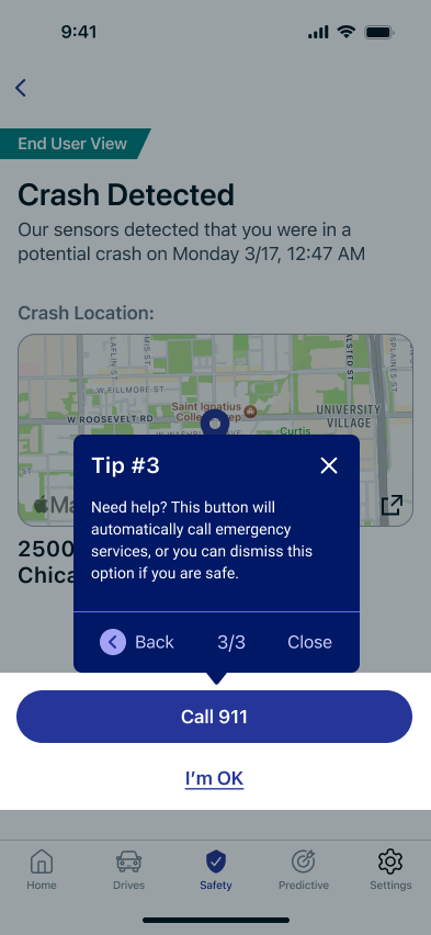
Taking the workflow diagram, I recreated the experience in Figma, using interactive tool pop-ups and callouts to make the flow intuitive and user-friendly, staying mindful of where and when I implemented pull relatives versus push relatives.
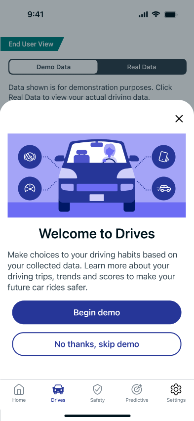
During this phase, I decided to break the tutorial into smaller, optional modules so users could pick the demo they wanted to see. I created a prototype for this process, which is available to view as a Figma file here:
The new tutorial delivers a tangible improvement by enhancing the sales team's confidence and ability to showcase the app, which in turn helps customers better understand Arity's offerings. The project's success was marked by my ability to make concrete design decisions that directly solved a key business problem.
Ultimately, I learned the value of combining expert evaluation with personal experience and presenting a clear, compelling solution to stakeholders. I'm happy to say that my final shareout presentation with the Mobile Publishing team was a huge success, with my design being accepted and slated to implement immediately within the Preview App.


Invest stress-free with Vanguard's Digital Advisor, which personally customizes investment strategies for each user.

How might we improve our content review process with Marketing, Legal & Compliance, and Design across projects?

